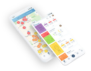
Via my phone's default weather app, which uses weather.com, I received air quality readings. I downloaded IQAir AirVisual recently, and I've been puzzled by the fact that the reading of weather.com is consistently much higher.
For example, right now, I see the following readings:
- weather.com: 113 (I believe this is some sort of composite score)
- IQAir AirVisual: 42 (US AQI; this seems to be based on the same sensor as the one below)
- AirNow: 49 (NowCast AQI)
- AirNow Fire and Smoke Map: 27 (NowCast AQI; based on PurpleAir low-cost sensor)
These scores are all pretty poor right now, so it seems a little insignificant, but weather.com and AirVisual were both triple digits as recently as yesterday, with the weather.com reading sometimes reaching 200 due to the wildfires.
Answer:
The fire and smoke map of AirNow shows purple air sensor info but corrects it using an equation created after years of side-by-side research compared to official monitoring stations. Raw purple air data has high biases at high levels of smoke. Many 3rd party apps pull the raw purple data so that higher values are usually displayed. Daily AirNow, without any feedback from sensors, uses only official monitoring stations to craft the AQI. Data of higher quality but less coverage.
AQI or air quality index is a combination of variables and a formula to combine them into one number. Low numbers are good. Look for PM 2.5 numbers and compare them. They use different methods to calculate AQI with a large component being PM 2.5.


